I am a graphic designer. I design stuff for a living. Go me. I’ve written before about fonts and how your font choice says a lot about you as a designer.
I don’t use out-of-the-box fonts for logos. I only use box fonts for blocks of text, e.g. this blog post, because they’re legible. The key to blocks of text is readability. No one will bother reading your snazzy sales copy if its written in hieroglyphs.
For logos, I create my own font like I did where it says Fish Of Gold in the header. You won’t find that font anywhere but here because I made it myself. It is mine. I own it and nobody else can have it. Bwa ha ha.
Today, I’m going to talk about fonts because I am sick to death of seeing crappy design. Specifically, I see lots and lots of bad graphic design on my commute mostly on the sides and back of semi-trucks. A semi-truck is a huge canvas. You can put anything you want on it. For a graphic designer, a semi-truck is pretty exciting.
Some graphic designers–and I use the term very loosely here–see a semi-truck as a way to cram an entire sales brochure on there as if anyone is going to read 1000 words while flying by a semi on the freeway. Some go the minimal route and just put initials without so much as a phone number, web address or any inkling as to what the company is selling. Some even misspell things. Oooh boy, do they misspell things. Some have absolutely no goddamn clue what they are doing.
Here’s an example of the absolutely-no-idea-what-they’re-doing variety. On the way to work this morning, I saw a logo like this one on the back of a semi-truck.
 This is an example of poor font choice. I presume that it is supposed to read NTS, but all I could see from several hundred feet until I examined closely, was TITS. The problem here is that it mixes san serif (a font without any extra squiggles) and serif fonts (serif has extra squiggles on it), like so:

The N in the logo above is serif, the T and S are sans serif. You shouldn’t mix serif and san serif, especially not in the same word.
Also, the T and the S are capitalized and the N, for some unknown bloody reason, is not. The lower-case N actually looks like a T and an I with bad kerning. Kerning is what we call the space between the letters.
So, instead of advertising NTS, I saw a truck yelling TITS at me. GOOD JOB. I am curious as to what the future trends in TITS are though.
By the way, “meeting future trends” is a completely meaningless tagline. It means about as much as “Fish Of Gold: slamming the potbot.” Future trends are trends in the future. You can’t meet them because, by definition, they don’t exist yet.
Anyway, back on topic: today, I am going to discuss some font choices you should never make.
Comic Sans

We’re going to get this one out of the way from the start. This font has a lot of haters with good reason. It is the elementary school of font choices, which is fine if you’re designing something for an elementary school. If you are designing anything other than a flyer for six-year olds, don’t use this font. It will make you look like you a) have no idea what you’re doing b) have paste stuck in your hair c) own lots of cats, at least a dozen, and d) are an elementary school teacher who still writes checks at the grocery store. Or all of the above. If you would like any of those things to be applied to you, by all means, go ahead and use Comic Sans. If not, don’t use it.
Impact

Impact used to be alright. If you needed a font to highlight something super important on a page, this was your font. It was used very sparingly as it is the initiating thermonuclear warfare of fonts. That is, until LOL cats came along. If you have ever seen a LOL cat, you have seen Impact.
Nowadays, it’s associated only with cats, bad grammar and yelling in your face. It hurts your eyeballs.
Hobo

Hobo is as relevant today as the word “hobo.” It is the get off my lawn of fonts. It’s illegible, unapproachable and cutesy all at once. It is an affront to your eyes and should never be used.
Papyrus

Papyrus is the tired performer drinking in his car after a children’s party because he used to be somebody of fonts. I think we’ve all had enough of this one, right? It’s not classy. It’s not unique or whatever you might think it is. It is illegible and stupid. It is about as common as a penny since it comes standard with every computer ever made.
Edwardian Script
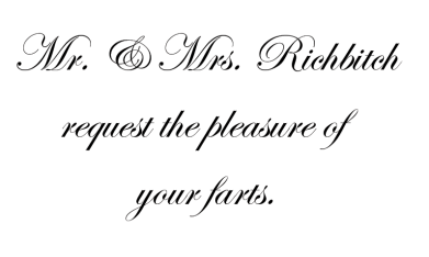
Script fonts are the nouveau riche of fonts. Why people insist on using this for invitations is beyond me. Unless you are Prince or Liberace, you don’t need that many ruffles.
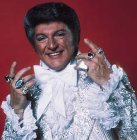
Image from wikipedia.org
I’m not saying we should send out wedding invitations in Helvetica, but using Edwardian Script in anything other than a wedding invitation is just self-important and poncy.
Old English
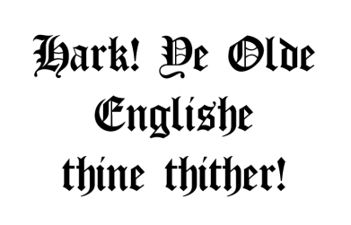
Olde English is the illegible great-grandfather of all other illegible fonts. Pah. Unless you are printing a sign for an actual English pub, you don’t get to use this one. We have something called New English now. It looks like this: We don’t need your old ass font.
Hand Print Fonts
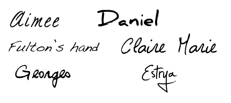
Hand print fonts are the high school yearbook of fonts. There are a million different fonts that are supposed to look like handwriting. They almost always are named something that sounds like it could be a person. None of them are people. None of them look like real handwriting. You know why? Because they’re fonts, not handwriting. For example, here’s my actual handwriting versus a hand print font by someone named Bradley:
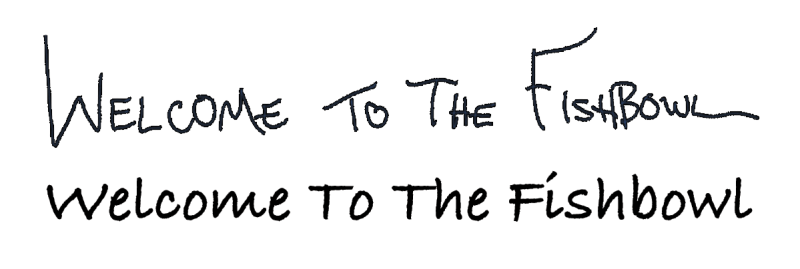 Which one is more varied and interesting? You best say the first one or you’ll be totally wrong. The first one is my handwriting. Notice how it’s not in a straight line, most of the letters are different sizes and some of the kerning (space between letters) is not the same? That’s because that’s how real handwriting looks. It’s imperfect. It isn’t in a straight line. The Os, Ts and Es are all different from each other. The letters are different sizes. It has character, which none of these hand print fonts do. They are pale imitations of the real thing. If you are using a hand print font for anything more than writing a name, you’re using it way too much.
Outline Fonts

Just to clarify, that’s not white text with a black stroke around it. That’s black text with the middle missing for no discernible reason. This is the same font in regular and outline form:
 Outline fonts are the starving supermodel of fonts. Does your font have vacuous space in the middle? If it does, it is defective. Don’t use it. The only thing that negative space in the middle accomplishes is to make it harder to read.
Cutesy Girlie Fonts

Girlie fonts are the locker poster of fonts. Unless you actually are a pre-teen girl, don’t use cutesy girlie fonts like Curlz or Giddyup because I will come to your house and smack you upside the head. Don’t use these fonts to sell to pre-teen girls either because it’s damn creepy. Like pedo creepy. Stop that.
Grunge Fonts

Grunge fonts are about as relevant today as grunge music. They are the anonymous threat made by cutting out letters from the newspaper of fonts. A grunge font, by definition, is messy. They are usually followed around by a cloud of dirt like Pig-Pen from Peanuts. Grunge fonts are about as hip and edgy as Charles Schulz, who is dead.

Peanuts by Charles Schulz


