

I am a graphic designer, which means I instinctively evaluate every bit of design I see from billboards to websites. I can’t help it. I would imagine most people in an aesthetic line of work do the same. I think a dentist would have a difficult time speaking to someone with a snaggletooth at a party without wanting to tell them what to do about their teeth. It’s the nature of working on appearances.
I’m not a trendy designer. I don’t troll websites and trade magazines looking for the latest, flashiest trends. I have a style that is all my own. Still, I like to see what else is out there. Most of the time, I see design that annoys me, but sometimes, I see something that inspires me.
I have also accepted David Bowie as my personal lord and savior. In other words, I’m a Bowie fan. He’s been making music longer than I’ve been alive so I sort of grew up with him. Consequently, when I happened across a site talking about the new design for David Bowie’s latest album cover, I took a peek. This is what I saw:

What? That’s got to be a joke, right? I read the article expecting to find a “Just kidding! For the real cover, click here!” Instead, I found an insipid article written by a pretentious, long-winded and downright lazy “designer.” Below is the text of the article, which is an ouroboros of self-congratulation since it seems the questions and answers were written by one and the same. Let’s take it question by question, shall we?
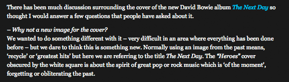
“We wanted to do something different with it–very difficult in an area where everything has been done before–but we dare to think this is something new.”
Really? Why do we even bother if there’s nothing new? I think from now on, I’ll just copy other people’s stuff and throw a box on it since there’s nothing new to design. Maybe I’ll just go live off the land in the woods since apparently graphic design is obsolete and creativity is dead.
I suppose, in the most reductive sense, taking someone else’s work and throwing a white box on it could be considered “new.”
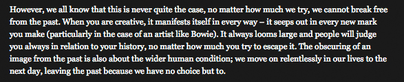
“When you are creative, it manifests itself in every way–it seeps out in every new mark you make.”
When you are creative, it doesn’t generally manifest itself by taking someone else’s art and throwing a box on it. I’m just saying, creativity seeping out isn’t usually associated with throwing a white box on someone else’s work.
“The wider human condition… we move on relentlessly in our lives…”
Really? I could have gone to an Artist Statement Generator and come up with better horsepucky than that. Let’s try, shall we?
Moving on.
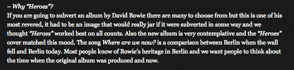
“The new album is very contemplative and the ‘Heroes’ cover matched this mood.”
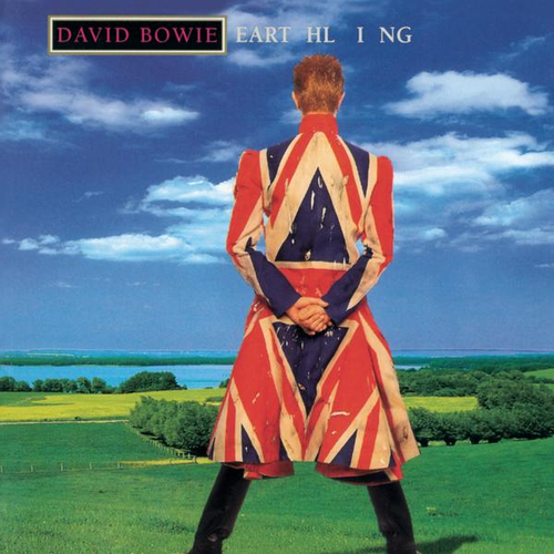
Yes, because nothing is more contemplative than throwing a white box on an old album cover. I’ll grant that Heroes is a “contemplative” album cover, but is it really more iconic and instantly recognizable than this?
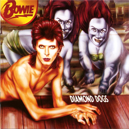
Or this?
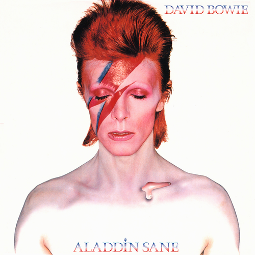
OR THIS!?
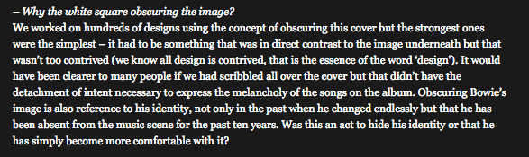
Finally, the question we’ve all been wondering: “Why the white square obscuring the image?”
“We worked on hundreds of designs…”
Wait, back that up. Hundreds of designs?
“We worked on hundreds of designs using the concept of obscuring this cover but the strongest ones were the simplest…”
HUNDREDS OF DESIGNS!?! And this was the one that was chosen? What were the others? A triangle with Helvetica? A circle with Arial? If it takes this many words to describe the deep meaning of throwing a box on it, you have failed.
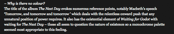
Macbeth? Waiting For Godot? You’re summoning Shakespeare and Samuel Beckett to justify your total lack of creativity? Stop that.
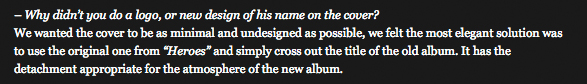
“We wanted the cover to be as minimal and undesigned as possible.”
Undesigned is right. That’s about as undesigned as it gets, you hack. I could have done that album cover in under a minute. Good job. If I were you, I would have said there’s a logo hiding behind the white box I threw on it.
See what I did with that image there where you were hawking your font wares? You see, I “felt the most elegant solution was to use the original one from” your stupid website “and simply cross out the title.” Do you like that? See how creative I fucking am? DO YOU FUCKING SEE?!
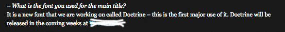
“It is a new font that we are working on…”
Why would anyone care about the damn font? It’s about as unoriginal as the rest of the design.
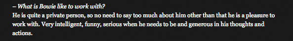
“What is Bowie like to work with?”
It fucking kills me to think that David Bowie actually picked you to design anything. Instead, I’m going to go with the theory that Bowie thought it would be hilarious to make you the butt of a joke, because you are. David is on his own private island reading your pompous twaddle and laughing his head off.
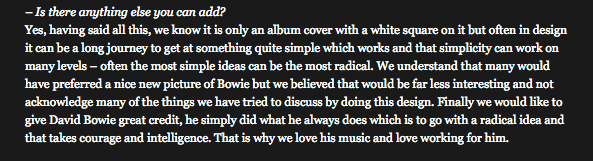
“We know it is only an album cover with a white square on it.”
That’s the first intelligible thing you’ve said. You should have left it at that. For the record, there’s nothing “radical,” “interesting,” “contemplative” or “creative” about throwing a box on it.
P.S.–The least you could have done is centered the damn white box. It’s not even centered.
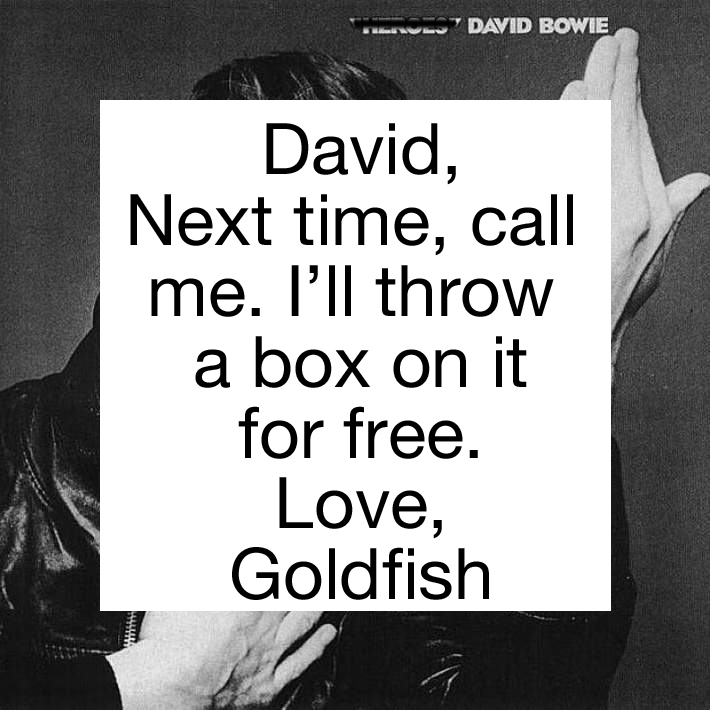
P.P.S.–It took 37 seconds to create that and my white box is centered.
